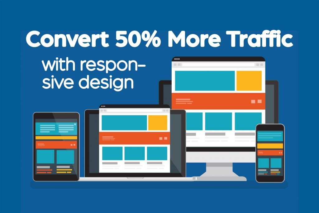
 A long time ago in a galaxy far far away (at least that is what it seems like), very few devices existed that could display websites. During this time period, web designers would develop a site that looked great on the most standard resolution that existed. As a few more devices made their way on the scene, web developers used mobile switchers, which would deliver a completely different website and user experience depending on which device (desktop or mobile) they were using. In this article will discuss the problems of the past and how responsive design allows you to capture 50% of your audience and make you look great at the same time.
If you want to jump down and just learn how this affects your traffic, click here to learn about mobile-friendly tests.
The Problem with Mobile Switchers
Websites still exist with this technology, so why is it an issue? With mobile switchers, you have to develop a separate website for each device. This means anytime you want to make the smallest change to your site, you may have to update it in three, four, or more places. In addition to this, new devices hit the market every year. Let’s take a bet that the resolution for the new device is not going to match what you have built on your site. Therefore you will need to create another version of your site. For the large corporation that has a dedicated web team, this may not be an issue at all, but I’m going to assume that you don’t want to waste the time or the money.
A Site Without a Mobile Version
Have you ever had to squint to see something on a website when viewing your phone? Have you ever had to pinch and zoom around a site to see everything? How about click on the wrong thing because they were too close together? Responsive design takes care of all of that. You have one website that you have to make edits on and it resizes to make everything visible on any device.
The Solution: We Have the Technology
Every site we build includes responsive design at it’s core. Not because we love it (even though we do), but because Google loves it. Google hates poor user experience. In fact, most of the algorithm that determines SERPs (search engine result pages) revolves around delivering the best user experience for search engine users while making Google money.
Responsive design takes hardcoded values and makes them proportional to the device’s screen they are rendered on. This means instead of a website being 1920 pixels wide, it will be set to 100% of the screen size. It also means as screen sizes get smaller, parts of the website that were columns sitting side by side will be converted to rows sitting on top of each other.
Mobile-Friendly Test
In April of 2015, Google began to penalize sites that were not mobile-friendly in search results. They were not just being mean and wanting you to update your site. The truth is that mobile and tablet usage has skyrocketed. In late 2016, Google released that over 50 percent of searches were made via a mobile device. If your site has a poor user experience, you are creating a poor user experience for potentially 50% of your visitors. Do you think they will want to buy from you?
Google released a mobile-friendly test, which you can use to check your site.
https://search.google.com/test/mobile-friendly
We Can Fix It
If your site comes back as not mobile-friendly, you need to take action. Every website we design, we start with mobile in mind. We do not ever develop a site without responsive design. Increase ROI from your website begins with thinking about your potential clients.
Don’t lose out on potential clients, contact us for your free consultation.